The Bank of England expects inflation to rise to nearly 3% by the end of 2021. Departing Bank of England chief economist Andy Haldane thinks that this is a rose-tinted view of things: he reckons that inflation will be closer to 4% — around double its present level.
Suddenly, inflation is become a political — and economic — hot potato. It’s not just Andy Haldane disagreeing with his former boss, bank governor Andrew Bailey. It’s Rishi Sunak disagreeing with Boris Johnson about the so-called pension ‘triple lock’, which this year looks to be eye-wateringly expensive for the government, thanks to higher inflation.
A short-lived spike? A temporary rise? We shall see. I have my doubts.
But what is clear is that inflation is a devastating destroyer of wealth and standards of living.
Which, as investors with an eye of long-term wealth accumulation, is something that should definitely worry us.
Wealth erosion
Over the long term, the Bank of England’s rate-setting committee is sanguine about inflation of 2% — the point above which the governor must write to the chancellor of the exchequer, explaining why.
But while 2% is deemed politically and economically acceptable, it’s not without a cost to consumers, savers, and investors.
With 2% inflation, the purchasing power of your money is cut to 82% after 10 years, meaning that it will buy you just 82% what it would have bought you 10 years previously. Over a 35-year period, the purchasing power of your wealth will be halved.
4% inflation wreaks greater damage. After 10 years, your purchasing power has shrunk to 68% of what it was, with it taking just 18 years for your purchasing power to halve.
For long-term savers and investors putting money aside for a comfortable old age, it’s like seeing the goal posts move further and further away.
The power of the stock market
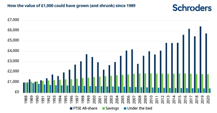
The clever people at investment bank Schroders have just carried out some interesting research, producing a fascinating chart.

Essentially, they’ve gone back to 1989 and calculated what would have happened to the inflation-adjusted returns of £1,000 invested in the stock market in 1989, saved in a savings account, or just stuffed under a mattress.
Under the bed, the chart shows the purchasing power of that £1,000 slowly sink. By 2020, it’s worth just £428, having experienced a negative growth rate of -2.6% over the period.
How about £1,000 saved in a typical UK bank account? Well, the good news is that the returns are positive: £1,000 saved in 1989 was worth £1,818 in purchasing power terms in 2020, an annual growth rate of 1.9%.
Saved in the stock market, though, and using the FTSE All-Share index as a benchmark, that £1,000 is worth £5,751 — an annual growth rate of 5.6%, or almost three times as high that achieved in a bank account.
ISA insights
So where do people actually save and invest their money?
We don’t know how much gets stuffed under mattresses, to be sure.
But we do know quite a bit about what people do with the money that they put into their Individual Savings Accounts — ISAs to you and me.
And that’s because every June, the Office for National Statistics publishes a statistical release detailing this, slicing and dicing the data in an almost bewildering variety of ways — by investors’ age, gender, income, geographic location, and inside leg length. (OK, I made that last one up, but you get the idea.)
The latest release — published on June 15th — covers the 2019-2020 ISA subscription year, although some of the tables go back to the 2008-2009 subscription year.
And the picture is absolutely fascinating.
Shares beat cash
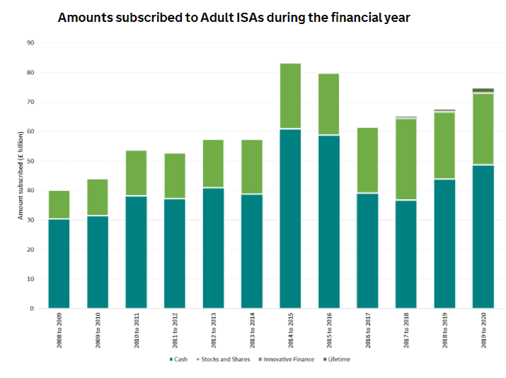
Essentially, in most years between half and two-thirds of the money put into ISAs goes into cash ISAs, and between half and one-third into stock and shares ISAs. Occasionally, just a quarter gets put into stocks and shares ISAs, and three-quarters in cash ISAs.
In the 2019-2020 year, for instance, £75 billion was subscribed overall, with around £25 billion going into stocks and shares ISAs, and around £48 billion into cash ISAs.
Here’s the chart — see for yourself:

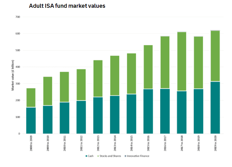
But what happens to the money after it’s been invested? The Schroder data gives us a very broad clue. That’s right — the proportion invested in stocks and shares ISAs grows much faster. Much, much faster.
Again, here’s the chart:

So where are you investing? Where do I think you would be better off investing your ISA money? Particularly if an era of higher inflation is around the corner?
You don’t have to be a genius to figure out the answer.


